Magazine Style websites emulate Cards UI design. Although, this style originated for news and magazine websites, they are now popular with other content-heavy blogs and portfolio websites. Characteristics of this design include Containers featuring Teaser Cards (i.e. an image or text tag with a link to the full article) grouped by category, chronology or popularity. These Containers can then be stacked vertically, horizontally or in a tabbed manner to create a webpage.
This design is suitable for regularly updated blog-like websites with diverse content. The key advantage of this design compared to a traditional blog design is that it allows prioritization and display of content based on relevance rather than “recency” (i.e. chronological order).
One of my favourite magazine style website is a WordPress template called Sahifa by TieLabs. Let me walk through the five C-s of a magazine-style website, using Sahifa as an example:
- CONTENT
- CATEGORY
- CARDS
- CLUTTER-FREE LAYOUT
- CMS
#1 – CONTENT
Magazine Style design is a good-fit for content-rich websites only. If the main aspect of your website is your frequently updated blog, then this style is for you. However, if the blog posts are few and far between, it will mar the aesthetic of this design. On the sample home page of Sahifa over 50 post “teasers” are displayed. The more, the merrier (but read more on keeping in clean in #3)!
#2 – CATEGORY
Apart from the quantity and frequency of contents, diversity of the content is another key element for magazine style websites. Using categories and tags, a magazine style website can help segregate and display these diverse in an appealing and user-friendly way.
Traditional blogs have the functionality to group contents by Categories and Tags. Categories allow for a broad grouping of article topics. Tags help to describe the post in more details. For example, this post is put in the category of Web Development, but is tagged with Magazine Style Website, Sahifa, WordPress Theme, Card UI and the list goes on.
Sahifa can display Category pages where posts pertaining to a category are displayed on single webpage. Based on Category, the logo, background, colours and layout of the webpage can be customised. See the examples below to see the customisation for Videos and Fashion categories:
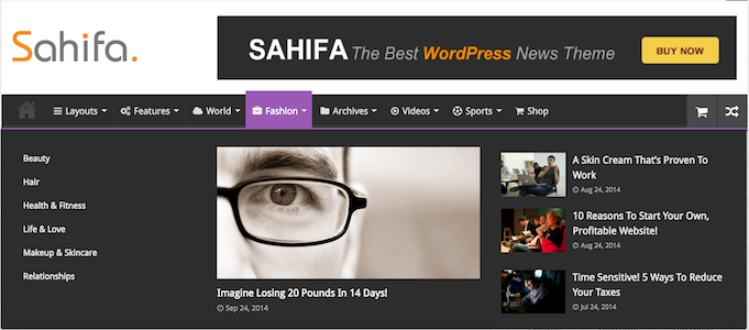
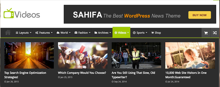
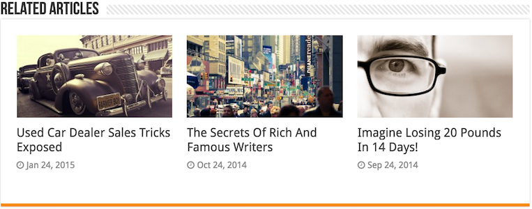
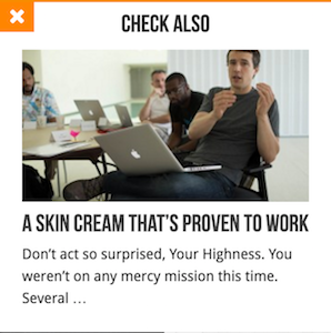
Another wise use of Category and Tags is to find and display related article(s) to the visitors based on the current article being viewed. Sahifa uses “Related Articles” containers and fancy “Check Also” popups to guide the user to related content.
#3 – CARDS
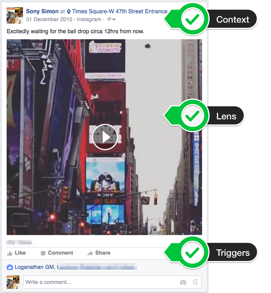 The basic building block of a Magazine Style website is a Card. In Card UI design pattern, a card has 3 components – Context, Lens and Triggers. In the Facebook post shown:
- Context is the post information like author, date and location
- Lens is the post content (in this case the video) and
- Triggers lets the viewer interact with Card (in this case Like, Share or Comment).
On a typical magazine style website, Context is the post details; Lens is the post excerpt and Trigger is a “Read More” button or a link to the full post.
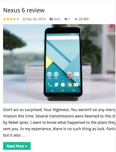
A teaser card in Sahifa can display the following post information:
- Title
- Link to the post
- Featured Image
- Post Excerpt
- Author
- Date
- Category
- Number of Comments
- Number of Views
- Review Score
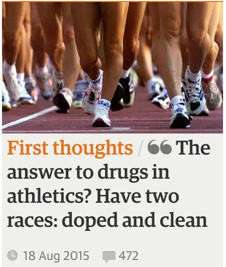
Simplicity is the key to a well-designed card! Cards are meant to be small rectangles that will fit on a mobile screen. Make sure the pictures used on the Cards are clear and crop them correctly for display. Keep an intriguing title. Use simple typography for excerpts to keep them legible. Make them unique with an animated effect or a colour scheme.Check out this “The Guardian” news site card. It is not the image or the aesthetic that draws us to this card. It is the title. So, don’t forget the first C – Content!
#4 – CLUTTER-FREE LAYOUT
For a magazine style website, the home page is a portal to the rest of the content on the site. Visitors see headlines and excerpts from 4 or 5 different posts above the fold – a glimpse of what lies beneath. And that is all it takes to form an opinion about the website.
A slider at the top with featured posts from the top 3-5 categories of your website would be ideal. Another option is to have a grid of cards. Or you can have both with a Grid Slider (as shown on Sahifa)
Grid design is key to maintaining equal spacing. There should be sufficient borders and padding between the cards, as well as, the blocks of cards to avoid a busy screen. Since the type of content on your website may vary – text, audio, video, image, image gallery – it would be a good idea to map out some layouts in the design phase.
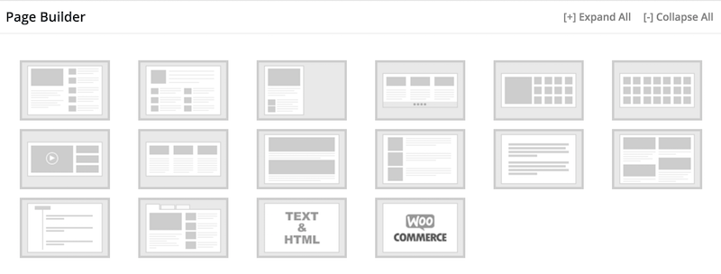
Sahifa comes bundled with a drag-and-drop Page Builder and a bunch of Container styles (referred to as block layouts).
#5 – CONTENT MANAGEMENT SYSTEM (CMS)
All magazine and newspaper website makes use of a Content Management System (CMS). CMS designed to support the management of the content of webpages are called Web Content Management (WCM) System or WCMS.
WCMS is a software that provides authoring, collaboration, and administration tools to allow users with little knowledge of web programming languages to create and manage website content with relative ease. Most systems use a content repository or a database to store the website contents. A presentation layer (template engine) displays the content to website visitors based on a set of templates. Administration of the website is also typically done through browser-based interfaces.
There are a lot of free popular CMS software out there. Some of the popular names are WordPress, Joomla and Drupal. I did a comparison of these three CMS platforms in a previous article.
I couldn’t refrain from commenting. Well written!
Appreciation to my dad who given to me concerning this blog, this
webpage is actually awesome.
Way cool! Some extremely valid points! I appreciate you penning this post plus the remaining portion of the website is also really good.
Simply want to say your article is as surprising.
The clarity in your post is simply cool and i can assume you are
an expert on this subject. Well with your permission allow
me to grab your RSS feed to keep updated with forthcoming post.
Thanks a million and please continue the rewarding
work.
Thanks. Feel free to subscribe anytime.
Spot on with this write-up, I seriously believe that this
web site needs significantly more attention. I’ll more likely
be returning to find out more, thank you for the advice!
I think when I set up a blog I am going for this theme.
If I purchase this theme can you help set it up for me?