 Sony Simon Live. Love. Learn.
Responsive Web Design allows users to view the web pages across a broad range of devices and browsers in an easy to read layout and navigate with a minimum of resizing, panning, and scrolling. A site designed with RWDResponsive Web Design adapts the layout to the viewing environment by using fluid, proportion-based grids, flexible images and CSS3 media queries
These days, many websites are based on fluid grid systems. In a fluid grid system a web page is divided into columns (usually 12). Using this grid view makes it easier for web designers and developers to place elements on the page.
The very popular Twitter Bootstrap framework uses a 12-column grid system too.
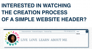
In this article, I will walk you through a step-by-step process in setting up a fluid grid system for your website using CSS3.
Step 1: Create the Grid System
In your CSS file, add the basics for a fluid grid system:
/* COLUMN SETUP */
[class*='col-'] {
   padding: 10px;
   float: left;
}
/* FLOAT LAST COLUMN TO RIGHT */
[class*='col-']:last-of-type {
   padding-right: 10px;
   float: right;
}
/* ROW SETUP */
.row:before, .row:after {
  content: "";
  display: table;
  clear: both;
}
Step 2: Set Column Widths
In my website, I set up 12 columns for the grid system. You can set up any number of grid system, but you need to ensure that the column widths add up to 100%
.col-1  {width: 100%;}
.col-2  {width: 50%;}
.col-3  {width: 33.33%;}
.col-4  {width: 25%;}
.col-5  {width: 20%;}
.col-6  {width: 16.6666666667%;}
.col-7  {width: 14.2857142857%;}
.col-8  {width: 12.5%;}
.col-9  {width: 11.1111111111%;}
.col-10 {width: 10%;}
.col-11 {width: 9.09090909091%;}
.col-12 {width: 8.33%;}
You can also enter custom widths as follows:
.col-quarter {width: 25%;}
.col-3quarter {width: 75%;}
.col-1third {width: 33.34%;}
.col-2third {width: 66.67%;}
Step 3: Make it Responsive
Working upwards from a device with the maximum width of 480px (phone screen) to up to 1200px I amended the widths after playing around a little on various screens/devices. This was the difficult bit, but here is what I did.
/* DESKTOP SIZE */
@media (min-width: 768px) and (max-width: 1200px) {
  .col-2,
  .col-7 {
    width: 100%;
  }
  .col-4,
  .col-8,
  .col-10,
  .col-12 {
    width: 50%;
  }
}

/* TABLET SIZE */
@media (max-width: 767px) {
  .col-4,
  .col-6,
  .col-8,
  .col-10,
  .col-12 {
    width: 50%;
  }
  .col-1,
  .col-2,
  .col-3,
  .col-5,
  .col-7,
  .col-9,
  .col-11 {
    width: 100%;
  }
}

/* MOBILE SIZE */
@media (max-width: 480px) {
  [class*='col-'] {
    width: 100%;
   }
}
Step 4: Using the Grid
The application part is very easy. You can use the below format to create any number of columns on your web page to place your elements.
<div class="row"><!-- TWO COLUMNS -->
   <div class="col-2"><img src="http://placekitten.com/800/400" /></div>
   <div class="col-2"><img src="http://placekitten.com/800/400" /></div>
</div>
<div class="row"><!-- THREE COLUMNS -->
   <div class="col-3"><img src="http://placekitten.com/400/400" /></div>
   <div class="col-3"><img src="http://placekitten.com/400/400" /></div>
   <div class="col-3"><img src="http://placekitten.com/400/400" /></div>
</div>
Here are some fun ways to place elements on your web page using the grid system.
A Full Width Image
A Two-Column Image Grid
A Three-Column Image Grid
A Four-Column Image Grid
A Two-Column Text Grid
Here is a view of the grid system in various devices. On a desktop, you can see the 4 cute kitty pictures in 4 columns and the two text columns. On a tablet, however, this is not displayed as 2 columns of pictures and a single column of text. Finally, on a mobile phone, all the content is displayed in a single column.
If you found this simple tutorial on creating a custom grid useful, let me know in the comments below or on social media. Feel free to check out more on Website and WordPress Development on my website.
This article was very useful. I was struggling to create one for my website. Then I found a sample code on the website but it did not make sense. You have nicely explained it and now I am able to create one on my own. Thanks.