 Sony Simon Live. Love. Learn.
I share my website articles predominantly on Facebook and Twitter, with an occasional share on Google+, LinkedIn, Pinterest and Instagram. I have also been helping a friend with her business social media updates. Between these two “hobbies” I have found some interesting aspects about sharing your website or article on social media platforms with a prominent featured image.
This article predominantly focuses on sharing the link to your website or article on Facebook, Twitter, Google+, LinkedIn and Pinterest.
In the best practices for sharing article, Facebook has shared the perfect dimensions for sharing a link to your website or article.
Use images that are at least 1200 x 630 pixels for the best display on high resolution devices. At the minimum, you should use images that are 600 x 315 pixels to display link page posts with larger images. Images can be up to 8MB in size. If your image is smaller than 600 x 315 px, it will still display in the link page post, but the size will be much smaller.
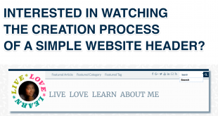
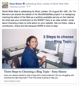
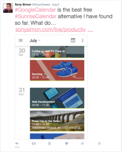
Here is an example of me using a 661 x 335 px image (Three Steps to Choosing a Blog Topic). Facebook cropped the width to 636 x 335 px (approx) to maintain its 1.9:1 aspect ratio and also the picture lacks quality especially when viewed on a desktop. Facebook will automatically scale photos using the minimum dimensions.
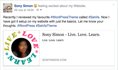
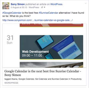
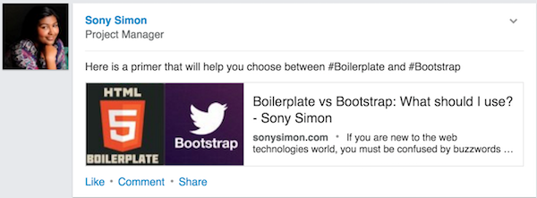
Here is also another example of me using a smaller image (200 x 200 px) which is why the image is shown on the left hand side of the link rather than a main image.
When you are sharing a website link on Facebook, it looks at the Open Graph tag og:image. This tag specifies the image that Facebook should use when sharing in the News Feed. You can use the OG Debugger to find and refresh the image Facebook will display.
If you want to know more about Open Graph tags and how you can set one for your website, I will be happy to help. Leave me a message.
In the developer documentation for cards, Twitter has also shared the minimum dimensions for a twitter image.
A URL to a unique image representing the content of the page. You should not use a generic image such as your website logo, author photo, or other image that spans multiple pages. Images for this Card should be at least 280px in width, and at least 150px in height. Image must be less than 1MB in size.
To be honest, I felt that was really vague. And initially when I was sharing content on Twitter, everything looked hunky-dory on the website. Here are a my twitter shares in various image dimensions: 1250 x 727 px, 660 x 330 px and 861 x 300 px. There is no cropping at all.
But I had a look at them on my mobile and that is when I realised these were all cropped to an aspect ratio of 1.75:1. Don’t believe me? Check this out.
When you are sharing a website link on Twitter, it looks for the Twitter Card tag twitter:image. This tag specifies the image that Twitter should display in the tweet and using “?fit=WIDTH%2CHEIGHT” you can even specify the image dimensions.
Last week tried, I decided to break the rules and use a 351 x 600 px image. Twitter website displayed it without any cropping. But both Twitter mobile and Facebook did its crop act, hacking it to keep up with their aspect ratios.
Google+
The Google+ developer documentation about snippets specifies only two criteria:
- must be at least 400px wide.
- must have an aspect ratio no wider than 5:2 (width:height).
An image meeting the above requirements is always rendered with a suitable width and no cropping.
Images with an aspect ratio taller than 5:3 are scaled to 506 px width, and then cropped vertically to 303 px height. Images with an aspect ratio between 5:2 and 5:3 are not cropped, but are scaled. Images wider than 5:2 are not rendered with a main image, but as a thumbnail.
Here is an example of what worked for an image at 660 x 330 px (5:2.5 / 2:1 aspect ratio)
And here’s an example of what didn’t work for an image at 351 x 660 px (5:9.4):
In this case neither the image width 351 px (less than 400 px) nor the aspect ratio of 5:9.4 (way taller than 5:3) helped!
Just like Facebook, Google+ also uses the Open Graph tag og:image. This tag specifies the image that Google+ should use when displaying the post. But Google recommends using the Schema.org markup itemprop=“image”. You can use these tags in your website or use the nifty Snippet Creator by Google to share your website or articles on Google+.
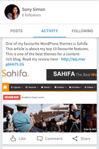
There are two ways to share your website or article on LinkedIn. Once is the easy way of just sharing the link. In this case, the featured image always shows up as a 180×110 px thumbnail. In the example below, the image dimensions of my featured image is 660 x 330 px.
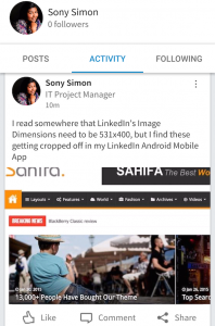
Alternatively, you can share an image with a link your website or article. But the image dimensions for this is tricky. will be displayed as a 531×400 px image. But on Android, I noticed that the best image dimensions are 531 x 350 px.
Just like Facebook, LinkedIn also uses the Open Graph tag og:image. And an image of 2:1 ratio will fit OK for a shared link in LinkedIn.
According to this detailed guideline booklet by Pinterest, we should…
Design pins with a vertical image aspect ratio of 2:3 to 1:2.8, with a minimum width of 600 pixels. (pg 8)
I checked my Pinterest board and noticed that when I expand a pin, the width is 735 px. Considering this and Pinterest’s recommendation above about the aspect ratios, an ideal pin image dimensions would be 735 x 1103. Also, using a standard image size will ensure the pins look well aligned on the board than haphazard (like mine below). And I tend to agree that it is the vertical pins that easily catch our attention.
Pinterest like Google+ uses both Open Graph tags and/or Schema.org markups to pick up the featured image for your website or article. You can use the Pinterest Rich Pin Validator to check if you are using all the right tags.
Image Dimensions in Summary
Here is a quick summary of the aspect ratios and some of the recommended image resolutions:
| Social Media | Aspect Ratio | Resolution |
| 1.9:1 | 1,200 x 630 | |
| 1.75:1 | 1,024 x 585 | |
| Google+ | 5:2 | 800 x 1,200 |
| 1.63:1 | 180×110 | |
| 2:3 | 735 x 1,103 |
But to make the job easier, I think we can get away with two resolutions:
- 1200 x 630 – This will be suitable for sharing content on Facebook, Twitter and LinkedIn.
- 800 x 1200 – This will be suitable for sharing content on both Google+ and Pinterest.
I also recommend leaving a 40px buffer on either side and a 10px buffer at the bottom, so even if the image is cropped no important text is missing.
Use different types of tags or markups to differentiate the image sizes, as follows:
- Open Graph tags for specifying the images for Facebook and LinkedIn
- Twitter Card tags for specifying the images for Twitter
- Schema.org markup for specifying images for Google+ and Pinterest
Instagram: You would have noticed that I left out Instagram from the list. With Instagram the images are at 1:1 aspect ratio (think Square) and best resolution is 1080 x 1080. But all about sharing your content on Instagram in another post.