USA Today website was redesigned and launched in September 2012 on the newspaper’s 30th birthday. Fantasy Interactive was the awesome crew behind this 1-year project. They won many awards including Adobe’s “Cutting Edge Award” for this project. So what makes the design of USAToday.com unique?
A typical News website has a lot of content. You have to tunnel your way through it like a mole. I have lost my way countless times while navigating through news websites (and YouTube!). However, USA Today website imitates the flow of a person reading a newspaper:
- Open up the preferred section
- Browse through the news headlines
- Read the full article of preferred headlines
- Move on to a different section and
- Repeat
Colour Coded Categories
When USA Today newspaper was launched in 1982, it was derisively dubbed the “McPaper”. This was because of its short articles (McNuggets) and its colourful display.
In 1982, USA Today emerged, revealing a new and noticeable design deviation. Along with the compacting of stories by using a tight writing style, USA Today included a bright and colorful display filled with photographs, maps, charts, graphs and other such informational graphics. While upholding modular design, USA Today did away with the spaciousness and simplicity many newspapers had adopted.
American Journalism: History, Principles, Practices
edited by W. David Sloan, Lisa Mullikin Parcell
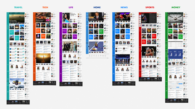
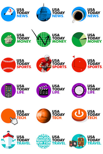
USA Today continues its trend of using colour to its advantage. Colours make it easy to find a section or category of news. Just like the newspaper, colours act as an important section cue. For example, blue for News, red for Sports and green for Money. This matches with its newspaper print colours. The below image shows the full length view of 6 section webpages.
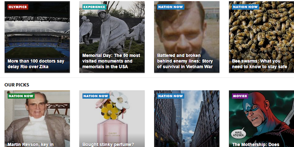
This colour coding is extended to its home page which has news articles from different sections, as shown in the picture below:
Single Page Application Design
USA Today website has made the browsing experience natural through its iPad app-like horizontal navigation. The website has two layers. Lets call them Section and Story.
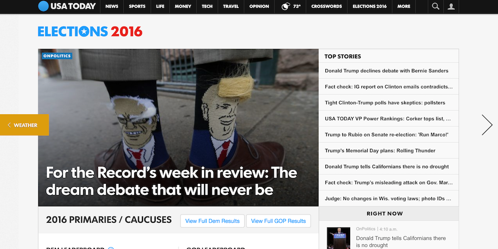
Section layer contains the various news section pages (e.g. News, Sports, Money). You can navigate left or right between these sections by clicking on either of the two big arrows. In the below image, I can click on the left arrow for Weather section. Or I can click the right arrow which will take me to News section.
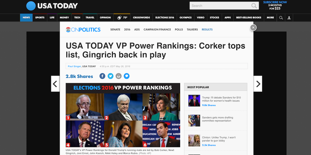
The section pages display “teasers”. Clicking on them will open the article on an overlay (i.e. Story layer on top of the Section layer). For example, if I click on the teaser “USA TODAY VP Power Rankings”, it shows the full article on an overlay. Clicking anywhere outside this overlay will take me back to the Section layer.
See it in action in this video:
USA Today Dynamic Logo
USA Today newspaper has a colourful changing logo designed by Wolff Olins. It is a live infographic that changes with the news. It reminds me of Google Doodle. It is a nice feature that can be incorporated on a website. See the picture below with some variations of its logo.
Under The Hood
Fantasy Interactive used a custom JavaScript stack – BackboneJS, RequireJS and Modernizr.
Backbone.js
Backbone.js is a JavaScript library designed to develop single page applications using MVC (Model-View-Controller) concepts. USA Today uses Backbone.Router module to manipulate its URL. It also uses Backbone.Event module to create a PubSub API. This API allows third-party applications and analytics packages to connect to the USA Today website.
REQUIRE.JS
Require.js is a JavaScript file and module loader. For a technically complex website like USA Today, organising the code into modules is a necessity. Require.js supports Asynchronous Module Definition (AMD). This allows modules to be loaded as and when required.
MODERNIZR
Modernizr is a JavaScript library which is designed to detect HTML5 and CSS3 features in various browsers, which lets JavaScript avoid using unimplemented features or use a workaround.
Case studies of your favourite websites will help you make a wish-list for your website. You can head over to my Case Study collection where I will have more articles on my favourite website design.
If you found this case study useful, let me know in the comments section.
And here is a bonus for you: I found the below video on Fantasy Interactive website. It gives a sneak peek into the design of USA Today website.
Saved as a favorite, I really like your web site!
Thank you Amy!
Thank’s great post.