 Sony Simon Live. Love. Learn.
The Guardian website was redesigned and launched in January 2015. On the day of its global launch there was immense negative feedback about the new design. And yet a year later it received the Website of the Year award from Press Awards. Here are two three things that made me lookup the design and development process of this website:
- Container Model
- Blended Content
- Open Source
Container Model
To understand Container Model, let me start by telling you three popular website design buzzwords – Modular Design, Card UI and Responsive Web Design (RWD).
Modular Design: Modular design is a technique in which every element (e.g. block of text, button) on the website is designed and built to fit into the grids of a block grid pattern. This design is especially useful for websites where there is an abundance of content, as content can be organised effectively without a cluttered look. Newspaper and magazine prints follow this approach by organising text and images into columns and boxes.
Responsive Web Design: Responsive Web Design (RWD) is an approach in web design to create websites that provide optimal viewing experience irrespective of the device screen size. Lots of laptops, smartphones and tablets with varying screen sizes and resolutions are being produced every year. So to create a website version for each screen size and/or resolution would be impractical. The solution to this problem is RWD. HTML and CSS is used to understand the device size or resolution and then manipulate the size, position and visibility of the content to display it aesthetically.
Card UI: Card UI is a design approach in Cards are the basic building block of a user interface or website. These Cards are then grouped into Containers to create an application or a webpage.
The Guardian website applies the Modular Design technique to create a Responsive website. Let me show you how they have implemented this.
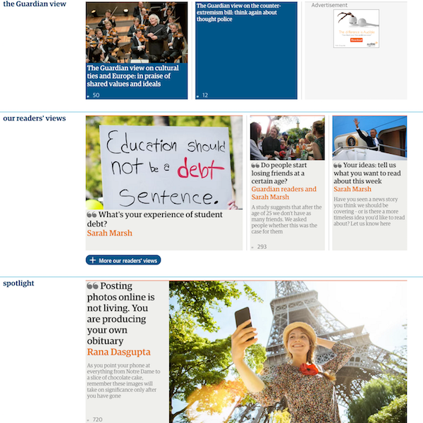
SLICE
On the home page news teasers and micro-ads appear in small boxes. These are referred to as Slices. In the image above, there are seven Slices. Each Slice holds a headline, an excerpt, an image, an ad or a combination of any of these. Clicking on a Slice will open the full news article. In Card UI design, a Slice is the equivalent of a Card.
CONTAINERS
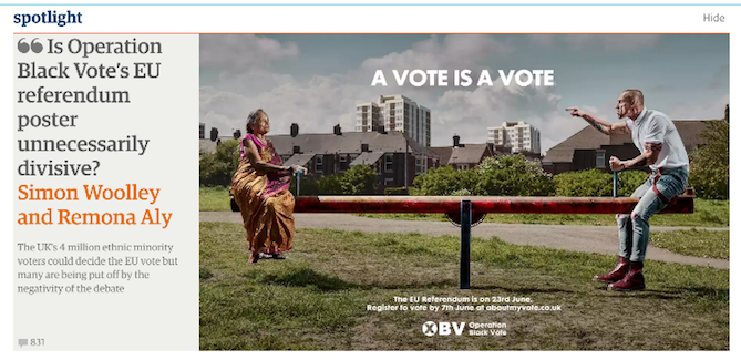
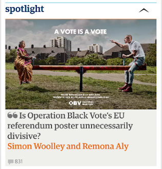
Slices are grouped together into Containers. In the image above there are three containers – “The Guardian View”, “Our Reader’s View” and “Spotlight”. Containers are full-width rectangular boxes. They can adjust to the size of the device screen. To achieve this, some elements of the Slice are hidden or resized. See below images of the same Slice on two different devices (iPad and iPhone). On an iPad the excerpt of the article is also shown. This is hidden when the webpage is viewed on an iPhone.
Stacks
Containers are stacked on top of each other to create any webpage. At the time of designing a page, the journalists can focus on the content (which in turn appears as a Slice) and the editorial staff can group them together into Containers and Stacks to display it on the website. Containers can be reused as well. For e.g. if a Container called “Most Popular” is created, this can then be displayed on the Homepage or under an article.
According to The Guardian Next website, its Container Model is defined by the following:
- Container is a full width horizontal element which contains a collection of content (referred to as Slice)
- Inside a slice are different elements, each representing a single story
- Container can appear in multiple locations in a variety of combinations
- As the screen size gets smaller or larger, the content inside adjusts to the width of the screen
- Pages hold a series of Containers which are stacked on top of each other, the most important at the top and the least important at the bottom
Blended Content
In a typical news website, articles are grouped and displayed based on the news categories (e.g. News, Sports, Finance, Travel). After running workshops with Information Architects, The Guardian decided to choose a less-trodden path. Rather than use containers on the page that simply replicate the main menu, they decided to go for a Blended Content. Content was aggregated from across the whole Guardian website and grouped based on other criteria rather than the news category. This format of presentation improves content discovery.
The Guardian Next website states that the initial set of blended containers they built were:
News – containing news and sport stories
Features – primarily non news stories
Most Popular – the most read stories across the site
Comment & Debate – containing not just our Comment is Free stories but comment and analysis across the Guardian
People in the News – stories and interviews with people in the news
Watch and Listen – video and audio from across the Guardian
Special – used for short duration news events like the Oscars where we want to package together stories on a single theme
The Guardian on GitHub
When The Guardian website was being redesigned in early 2014, Alex Breuer, Creative Director of The Guardian wrote:
Open journalism is fundamental to the Guardian. It emphasises a two-way relationship between journalists and readers that shapes our editorial strategy. This principle of openness extends to the development of the next incarnation of the Guardian on the web and native applications.
The Guardian website source code is available on GitHub. GitHub is a web-based source code repository that supports distributed version control. It is very popular amongst the open source developers. Having the second popular news website reaching out to the developer community of the world in this manner was overwhelming!
Case studies of your favourite websites will help you make a wish-list for your website. You can head over to my Case Study collection where I will have more articles on my favourite website design.
If you found this case study useful, let me know in the comments section.
And here are some further resources:
I see you don’t monetize your blog, i know how to earn some additional
money and get more visitors using one simple method, just
search in google for: How to monetize a blog Twardziel advices
Thanks Katie. But I am not currently not looking to.