In my article about Typography for Website Design, I mentioned that Rule #1 is to limit the number of Typefaces/Fonts used. In this article, I will give you some tips for pairing typefaces for the best duo for your website.
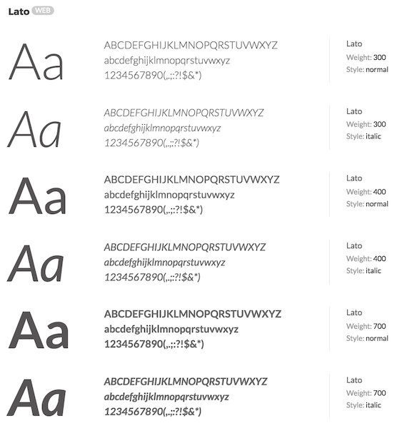
A typeface is a family of fonts. Within a single typeface, there will be fonts of varying weights (i.e. thickness) or other variations (e.g. bold, italic). Each such variation is considered a different font. For example, here is Lato – a typeface – with 6 fonts. The fonts shown below are Lato Light, Lato Light Italic, Lato Regular, Lato Italic, Lato Bold, Lato Bold Italic. In this case, a single typeface provides 6 variations.
Tip #1 Choose a Serif and Sans Serif
As I mentioned in a previous article, there are two types of fonts – Serif and Sans Serif. A font that has the small projecting features called “serifs” at the end of strokes is called Serifs. Sans Serif fonts do not have these serifs.
Pairing a Sans Serif typeface for the header with a Serif typeface for the body is a classic combination.
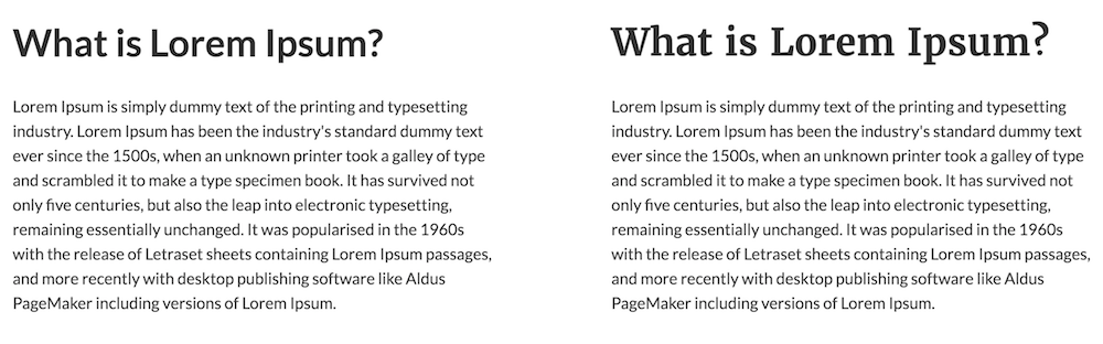
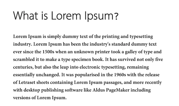
In the example below, on the left you have Lato (title) and Lato (body) and on the right Merriweather (title) and Lato (body). Which looks better?
Tip #2 Avoid Typefaces with Conflicting Personalities
Typefaces have personality – yes, believe me! For example, have a look at some of the fonts in the below image. The fonts themselves convey a message.
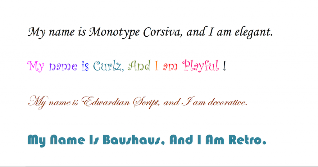
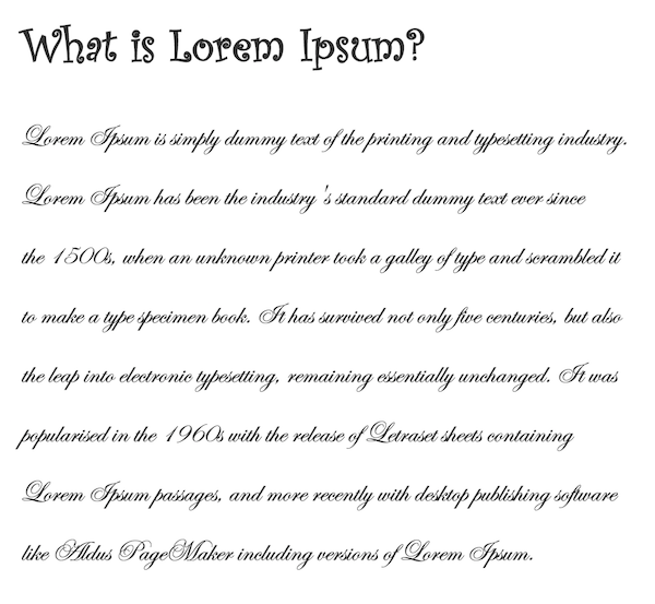
First off, make sure you are choosing the right typefaces to reflect the personality of your website. And when pairing typefaces, make sure the typefaces you choose do not have clashing personalities. Imagine using playful Curlz as the header for a page written in decorative Edwardian Script (i.e. fonts on lines 2 and 3 in the image above). Got the idea right? If not, see below the effects.
Tip #3 Avoid Disparate Typefaces
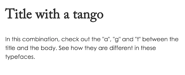
Typefaces can be very different in the way the individual characters are displayed. If these differences stand out then they don’t go together. Here is an example of Adobe Caslon (title) paired with Century Gothic (body). It is a Serif/Sans-Serif pairing. But look at those “a”,”g” and “t” between the two fonts. This is an example of what to avoid when pairing typefaces.
Tip #4 Use Fonts with contrasting Font Weights
Tip #5 Pairing Typefaces to Create Multiple Styles
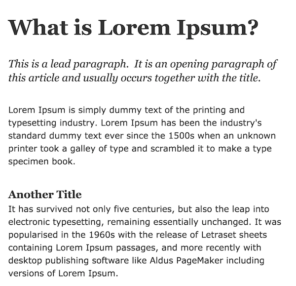
Sometimes you may think you need more than two typefaces to create all those different titles and paragraph types. But believe me, you just need two. You can even manage with one! In the example below, I have used only Georgia and Verdana. But with a combination of font sizes, line spacing and font weights, I have created a typographic variation.
- Title – Georgia Bold size 40px
- Lead Paragraph – Georgia Normal Italic size 20px
- Body – Verdana Regular size 16px
- Section Title – Georgia Bold size 20px
I think I may even have got away with just one typeface. 😉