When developing a website, there are traditionally two types of layouts based on how the dimensions of the web pages are set. These are referred to as Fixed Width Layout and Fluid Width Layout. In this article, I will compare and contrast the two for you and give you a few tips to work around some of the common problems in both.
Fixed Width Layout
A fixed width layout is also called fixed or static page layout. In this type of web page layout, the web designer uses a preset page size that does not change based on the browser width or device screen size. This is the layout I learned during my University days. This was the traditional layout for decades until responsive design and mobile phones as internet devices became popular.
- Designer’s favourite layout as it is easier to create
- Less hassle with displaying visuals (images, videos) and forms that have fixed-width
- Page design will look identical on all devices and browsers (albeit the scroll bars or excessive white spaces)
- Easier to maintain optimal line lengths using fixed width
- When viewed on larger screen resolutions, it will display excessive white spaces
- When viewed on smaller screens, the user will need to scroll horizontally or the content will appear very tiny and the user will need to zoom in.
- Tables in a fixed layout? A nightmare, I tell you!
- Low scoring when it comes to usability
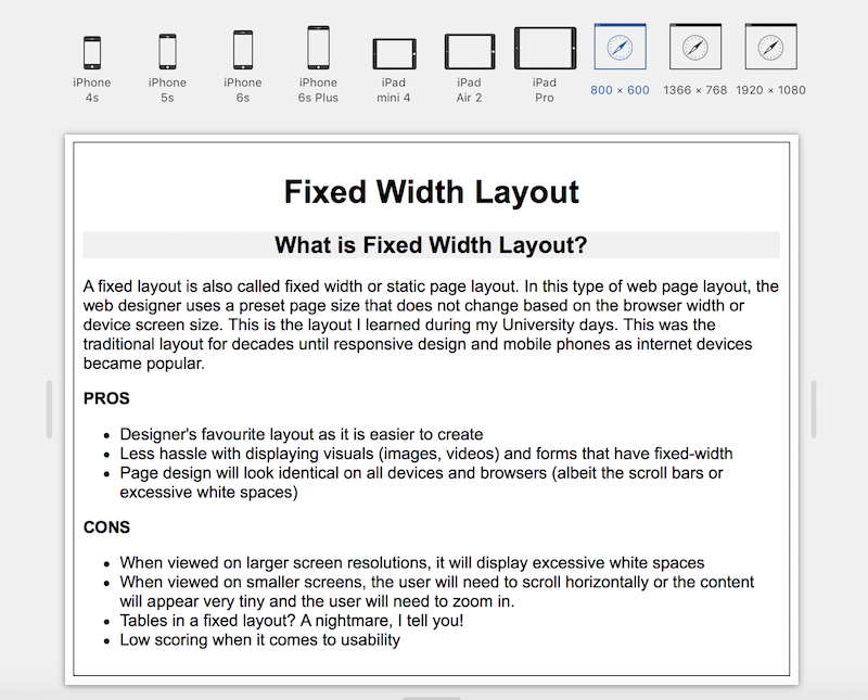
Here is a simple fixed width web page I created that looks perfect on an 800 x 600 screen (simulation)

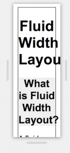
The page layout if not amended can display with varying issues – cropped and/or excessive white spaces being the most common issues. Look at this slide show with the various issues displayed on various screen sizes:
Few things to keep in mind if you are planning to create a fixed width layout web page are:
- Design for an appropriate page width. With a little internet research, I found out that there are a lot of sites created with the fixed page width of 980 px to cater for users with 1024×768 screen resolution or above. Another popular width is 760 px, which will fit well on an 800×600 screen.
- To avoid the layout from being displayed in a corner, make sure that the layout is centred. Setting the margin as –
margin: 0 auto;should ideally work. - Since desktops and mobile devices have vastly different screen sizes, providing a separate stylesheet will help display the site proportionately on a smaller screen.
- Facebook.com
- YouTube.com
- LinkedIn.com
- Twitter.com
Most of these had their page widths set in the 980 px range. And it’s worth noting that these websites have mobile-specific versions and applications.
Fluid Width Layout
A fluid width layout is also called fluid or liquid page layout. In this type of web page layout, the web designer uses relative units to define the page size that can change based on the browser width or device screen size.
Some of the popular relative units are percentages and em. “em” is used in relation to the font size. So 2em would mean twice the size of the current font size.
If the units are in “em”, then the layout is referred to as elastic page layout. When using the elastic page layout, the text contents will resize at the same rate. This keeps the sizes of the various textual content (e.g. headings, navigation menus) in proportion.

- This layout can be more user-friendly if used correctly as it is flexible based on users’ device and browser
- The correct amount of white space can be maintained between the contents or columns across all the devices
- On a larger screen, fluid width layout will make use of the larger screen real estate so users can view the content with minimal scrolling.
- The elastic layout is ideal if using a lot of textual content.
- Designers have less control over the users’ views when using the fluid width layout
- Unlike in the case of the fixed width layout, custom media dimensions or width limiters (like min-width and max-width) will need to be used when displaying visual media like images or videos. Width limiters are not supported on some of the older browsers which could impact the display of the web page.
Here is a simple fluid width web page I created and how it looks on various screen sizes (simulation).
Few things to keep in mind if you are planning to create a fluid width layout web page are:
- Although the web page can fluidly fill the entire screen, sometimes you may need to restrict this to maintain proportions or avoid overlaps. This is when the CSS properties
min-widthandmax-widthcomes handy. As noted earlier, these width limiting properties do not work with some of the old Internet Explorer browsers. However, I did find this article on Maximum and Minimum Height and Width in Internet Explorer which may help. - Fluid width layout is better suited for simpler designs with fewer graphic elements and complex techniques. You can also use CSS effectively to avoid disproportionate displays.
- Google.com
- Wikipedia.com
- Amazon.com
Hybrid Width & other Page Layouts
Now these are not the only two possible layouts. You can go for a hybrid of these too. Or with the advent of HTML5 and CSS3, you can use much more advanced techniques for your web page layout. All this and more in my next article. Until then, feel free to have a look some of the other Web Development articles here.
 Sony Simon Live. Love. Learn.
