As promised in my previous article about showing you how to set up a Style Guide in Frontify, here is the first article in the series to set up the first design element – Colour.
Before you set about creating your style guide, you need to gather the Hex or RGB values of the colours. So first let us get them organised into colour palettes.
Colour Palettes
Every style guide must include the website colour palette. This way when elements like buttons or markups like blockquotes are created, you can use the colours from within the palette. You must have 2-3 colour palettes (or sets of colours) for your website:
- Primary Colours: These are your brand colours – the main colours you intend to use on your website.
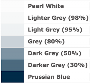
- Greyscale: These are shades of grey that can be used for backgrounds, borders, meta texts or other subdued elements on your web page.
- Secondary Colours (Optional): These are some additional colours that can be used on your web pages when creating colourful elements like charts or infographics.
- Gradients (Optional): These are tones, tints or shades of your primary colour palette for use in improving legibility.
Primary Colour Palette
Although creating a colour palette is one of the fun parts of web designing, it often causes paralysis by analysisCannot make a decision because of over-thinking. I wrote a couple of articles to help you choose colours. You can read them here:
- How to Build a Colour Palette for your Website?
- 3 Simple Steps to Convert an Image to a Colour Palette
I used the second method of using an inspirational image to choose colours in this palette. I went through the “paralysis by analysis” phase too. But then I got the help of a friend who works as a UI designer to nudge me in the right direction. An evening with a bottle of wine and Pantone colour cards was all it took.

For the record, my friend did warn me about that bright Lively Lime, but I never listened!
Since I am going for a BridalMostly white with pops of colour look, I chose my shade of black and white and then 3 accent colours (to go with the 3 categories – Live, Love, Learn). My shades of black and white are not black and white, but a dark shade of blue and a greyish white. Prussian and Pearl – that’s what I endearingly call them. Looks like someone needs to get a life outside web development and computers. U’oh!
Greyscale
No colour palette is complete without some greys. You can shades of grey for backgrounds, borders, dividers, sub-texts and sub-elements.

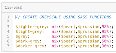
For creating the Greyscale, I used the mix function in SASS. Call me a geek! The percentages you see in the image are the weight values. But you can use any Colour Mixer tool out there. I would recommend the Colour Mixer from W3Schools. You can just enter your shades of black and white and then pick any number of colours in between. If you do not have a black and white in your colour palette, you can either choose the darkest and lightest colours (if they are nearly black or white) or just use the hex values #FFFFFF (true white) and #000000 (true black).
Secondary Colour Palette
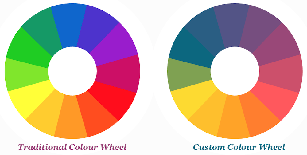
Sometimes the Primary Colours are just not enough! If you display charts and infographics on your website, then you will need more than a handful of Primary Colours. This article by Tom Osborne on Colour Mixing was my inspiration. I created the 6-colour Secondary Colour Palette using some of the methods specified in Osborne’s article. Then I extended the colour palette further by using SASS and mixing colours next to each other to create a custom colour wheel for the website.

Gradients
Gradients are useful when you want to change the contrast of the colour for better legibility or to create 3D/tactile effects. Here is another article by Tom Osborne on Tints, Tones and Shades that helped me understand the what and how of colour gradients.
Here is an example of the gradients of Zeal Teal

Setting up Colours in Frontify Style Guide
Once you have all the hex values of your colour palettes ready, it is very easy to put them together in Frontify.
Step #1 Setup Colour Palettes
There are 3 ways you can display colour palettes in Frontify – Drops (as shown under Primary Colours), Lists (as shown under Greyscale) and Cards (as shown under Gradients). This video will help you understand it better. Watch me set up a colour palette in Frontify in under 2 minutes.
Step #2 Define Colour Usages using Colour Scales
Colour scales can be used to show gradients, colour usages or colour combinations. In Frontify, you can create a colour scale by selecting Color Scale under Design Specifications.

Step #3 Include Interactive Elements and Examples
Since Frontify can display code snippets and UI patterns, you can use it to create interactive elements or examples of colour usages. You can insert this by selecting UI Pattern under UI Patterns & Code. I used it to create and display dynamically the custom colour wheel. Check out the video below.
Step #4 Include Colour Swatches
Using the Color Swatch option under Design Specifications, you can easily create a one-click download for developers with all the hex values of the colours. When a user clicks on it a zip file containing the colour definitions in .ase, .less and .scss formats will be downloaded. When creating a colour swatch you can choose the colour palettes you want to include in the file.

Step #5 Include Code Snippets
If you are mixing colours or creating special effects with your colour palette, then include the code snippets in Frontify.
When I started setting up the colour palettes in Frontify I had only 11 Hex values (5 Primary Colour Palette and 6 Secondary Colour Palette). Greyscale and Gradient colours are derived using SASS functions. So I included the code snippets to derive the Hex values of these. For example, here is the code snippet to create the 5-colour Greyscale Palette.

To insert a code snippet, you can select Snippet under UI Patterns & Code.
Before I go, here is some inspiring reading material by Tom Osborne, Vice President of Design at Viget regarding colour theory and relevant to usage in web design:
You can read all the articles in this series about setting up a Style Guide using Frontify by going here.
If you are doing something similar to this, please do get in touch. Let’s band up together and share our thoughts and inspiration. ?
 Sony Simon Live. Love. Learn.
