Are you planning to create a website that has just a handful of pages or sections? Then a One Page website or a Single Page website design is an excellent choice. A traditional website will have multiple pages and a clickable menu that can used to navigate to individual pages. But a typical one page website has only a single page, split into multiple sections referred to as Screens. Navigation controls may be present to help scroll down or up to a specific screen.
Why go for a One Page Web Design?
One Page websites are intuitive to use. The only thing the website viewer need to know to navigate a typical one page website is scroll. If designed and developed properly, one page websites can be easy to maintain and consume less bandwidth.
One of the most common use of a one page website is as a pre-launch website. If your company website is under construction, a one page overview about your company can be an ideal pre-launch website. If you are planning to start a blog website, then you can create a one page pre-launch website with a sneak peek and a newsletter sign-up form. I have also seen a lot of one page websites that act as single product e-commerce websites.
While searching for a good one-page website to show as an example, I found Sector, which is a one-page website template, on ThemeForest. Let me walk through some of the design must-haves for a one page website, using Sector – Demo 2 as an example.
Must-Have #1 – Visually Appealing Hero Header
Sector’s one pager starts off with a Hero Header. A hero header is an oversized display with a visual, text and/or navigation elements usually placed at the top of a webpage. The visual must be appealing and relevant to the content of the website. Judging the book by its cover is more common than one would like to admit. So choose the right “cover”, as it can make or break a hero header.
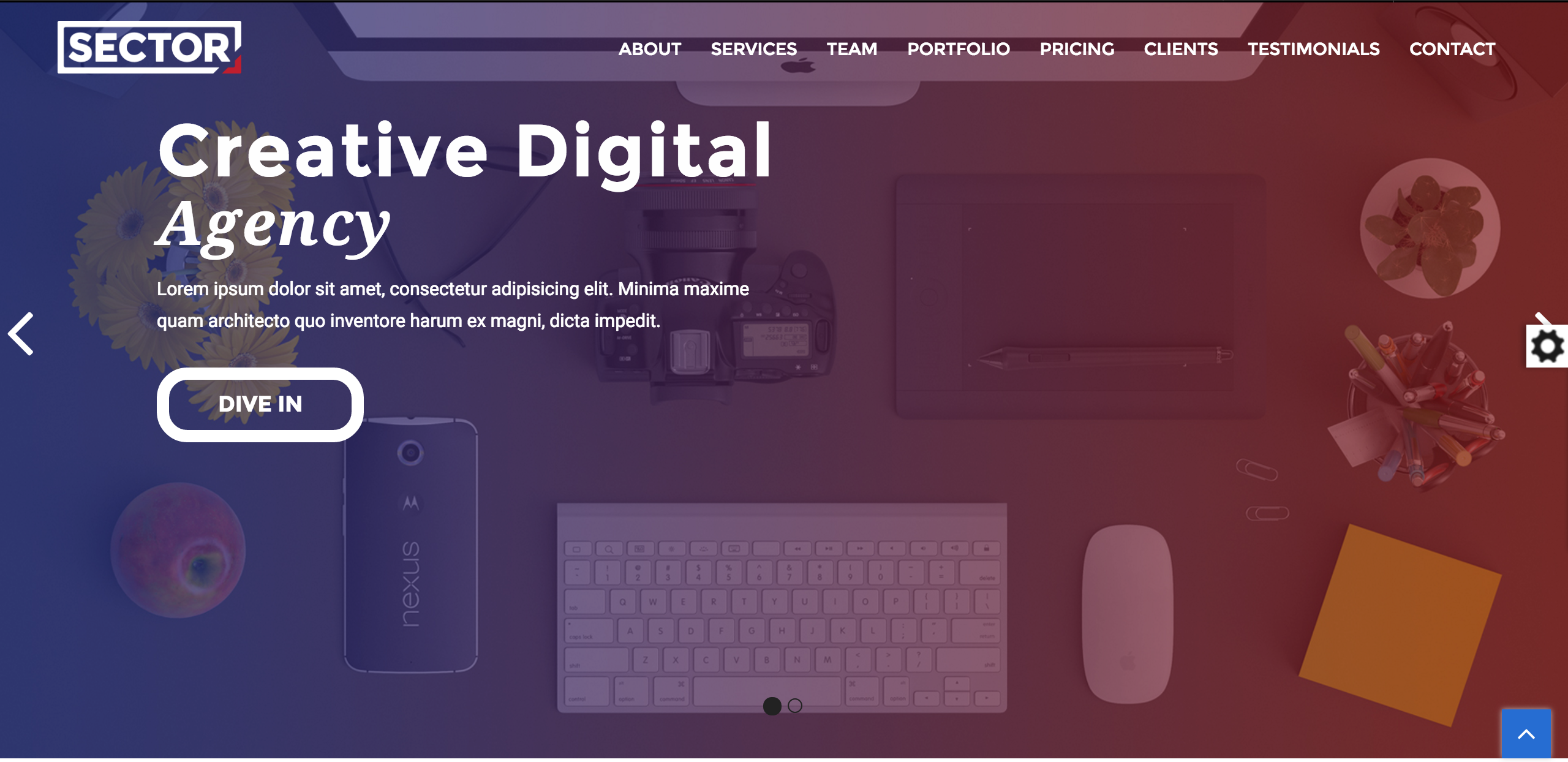
A visual on a hero header can be a single image, a video, a slider or an animation. In the Sector example, the hero header is an image slider. Clicking on the white arrows on the left or right of the image will horizontally scroll the header to display other images and content.
The big bold title seeks the viewers’ attention. The image acts as a beautiful and relevant background without distracting the visitors from the title.
Must-Have #2 – Sticky Navigation
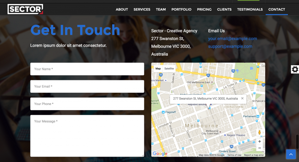
A strategically positioned Sticky Navigation makes the user navigation intuitive. When sticky navigation is used, the navigation controls are stagnant while the content moves. This helps with any orientation issues from long scrolling on a one page website.
On Sector, the navigation remains at the top right even if the viewer scrolls down the website. On the right bottom corner there is a blue arrow that allows viewers to head back to the top of the webpage, irrespective of which screen they are in. Clicking on the navigation links (e.g. About or Contact) will take the visitor down/up to the relevant section. But as shown in the screen shots below, the navigation controls are still visible.

Must-Have #3 – Responsive Design
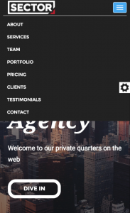
Responsive web design makes a webpage look good on devices (desktops, tablets, and phones) irrespective of its screen size. This is achieved by using fluid proportion-based grids and flexible images that can be resized, hidden or moved to fit any screen using HTML and CSS. Given below are screenshots of Sector from a mobile device. In order utilise the screen real estate to the maximum, the menu is “shrunk” to a Hamburger Button on the top right corner. Clicking on this will pop up the navigation links.

Must-Have #4 – Varying Backgrounds
If the entire background of a one page website is monochromatic, it makes the website monotonous. Colour blocking can be incorporated to demarcate screens and acts as a visual cue to the visitors to literally see where each section begins and ends.
Must-Have #5 – Parallax Scroll
Parallax scrolling has been around for over half a decade now. And one of the best places to use parallax scrolling is on a one page website. Parallax backgrounds is an excellent tool to engage visitors and improve the overall experience that a website provides.
The below video snippet shows both the varying backgrounds as well as the parallax scroll implemented on Sector.
 Sony Simon Live. Love. Learn.
I have been browsing on-line greater than three hours lately, but I by no means
discovered any fascinating article like yours.
It’s beautiful worth enough for me. Personally, if all webmasters and bloggers made just right content as you did, the net will likely
be a lot more useful than ever before.
Whats up this is kinda of off topic but I was wanting to know
if blogs use WYSIWYG editors or if you have to manually
code with HTML. I’m starting a blog soon but have no coding experience so I wanted to get advice from someone with experience.
Any help would be greatly appreciated!
Most of the blog websites these days (WordPress, Blogger, Joomla, Drupal) all come with WYSIWYG editors and you don’t need to do any coding. If you are fairly new to blogging I highly recommend checking out https://wordpress.com/
When you want to get the best value out of this post then you have to apply these
methods to your won weblog.
Hey Todd. I am still in the process of getting my website updated. A little patience! 🙂
Currently I am just going to complete my breakfast, when having
my breakfast coming over again to read through more posts.
I love your website.. very nice colors & theme.
Would you create this amazing site yourself or
do you hire someone to do it for you? Plz respond as I’m trying to create my blog and would want to know where u got this from.
kudos
Hi Leonard, I am using the Sahifa WordPress Theme. You can read all about it here – http://s693581096.websitehome.co.uk/learn/webdev/sahifa-theme-review/
You ought to take part in a contest first of the very most useful
sites online. I’m planning to recommend this site!
Nice read, I just passed this onto a colleague who was doing some research on that. And he actually bought me lunch because I found it for him smile Therefore let me rephrase that: Thank you for lunch! “Any man would be forsworn to gain a kingdom.” by Roger Zelazny.
I just want to mention I’m all new to blogging and site-building and definitely loved your website. Very likely I’m planning to bookmark your website . You amazingly come with really good articles. Many thanks for sharing your web-site.
Whats up! Are you using WordPress for your blog platform? I’m new to the blog world but I’m trying to get started and set up my own. Do you have any coding expertise to make your own blog? Any help would be greatly appreciated!
Hey Virgil! My husband runs a media company and they are an expert in creating WordPress websites. You can contact them on [email protected]
Hey there, I found this article very useful. Especially because you are showing a detailed example. Thank you. Keep writing.
Thanks 🙂
Just yesterday I was reading your other post about Magazine Style website and was going to go for it. Is it too early to change my mind? 😉
I am new to blogging and web development and truly liked yours. Thanks a lot for the share.
Hello! I just would like to give a huge thumbs up for the great info you have here on this post. I will be coming back to your blog for more soon.