Colours can convey a message and evoke a response in people. So understanding their meaning and cultural use is essential in using them on a website for non-verbal communication. Colour theory is a science in itself because colour is very subjective.
In this article, I will walk you through a 3-step process in setting up a very simple colour palette for your website. You can use this method if you have absolutely no idea where to start from and you don’t have a preferred colour palette in your mind. You can start with a blank canvass and build your colour palette step-by-step.
Step 1: Select Your Dominant Colour
This is the key and yet sometimes the hardest part. There are a few ways to make this easy:
- You can choose a Dominant Colour for your website based on its meaning. I have included an infographic below that will help you with this.
Colour Meanings (click to view)
Colour Meanings (click to view)

- If you already have a company logo designed, then the main colour on your logo can be the Dominant Colour of your website.
- If you have a favourite colour, just go for it!
If your website focuses on Content (e.g. Blog, eCommerce or Portfolio), choose a bright or bold Dominant Colour. If your website focuses on Branding (e.g. Corporate Website), choose a less intensive Dominant colour. This means you can use the Dominant colour in excess without overwhelming the website visitors.
Colour is more visual than verbal! Lets say, you decided to go for blue (being the #1 preferred colour and all that), but which shade of blue are you going for? There are 1000s of shades of blue.
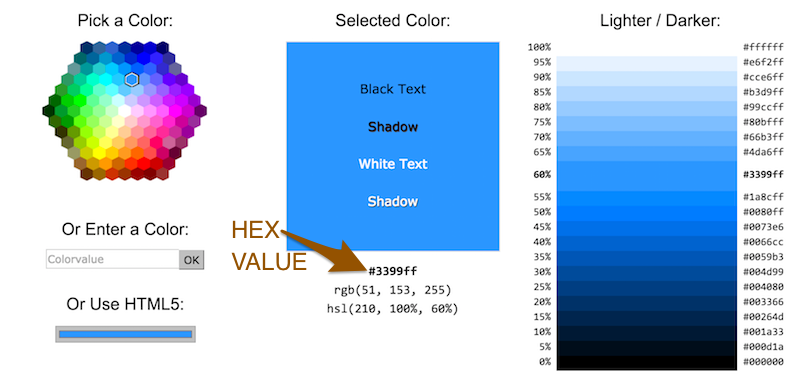
Be precise on your colour choice. You can do this by getting the Hex value of your colour. Hex values are codes used to identify colours. Having your Hex Value will also be handy for the next steps.
Get Hex Value (click to view)
Get Hex Value (click to view)
Go to W3Schools Colour Picker. Under “Pick a Color”, click on the colour you want (e.g. your preferred shade of blue) and you can find the Hex Value as shown below. You can further choose a specific shade of blue by adjusting the saturation and brightness.

BONUS TIP: While you are doing this, also have a look at how Black and White text is showing up under “Selected Color”. You will need this in Step 4
Once you have chosen a Dominant colour, pick out a tint and a shade (i.e. a lighter and darker version of the colour). If you use SASS this can be easily done using the darken and lighten functions – e.g. darken( $maincolour, 10%), lighten( $maincolour, 10%).
Now you have 3 colours in your palette. Something that looks like the below. In the order, these colours are Dominant (tint), Dominant and Dominant (shade):
Step 2: Select Your Accent Colour
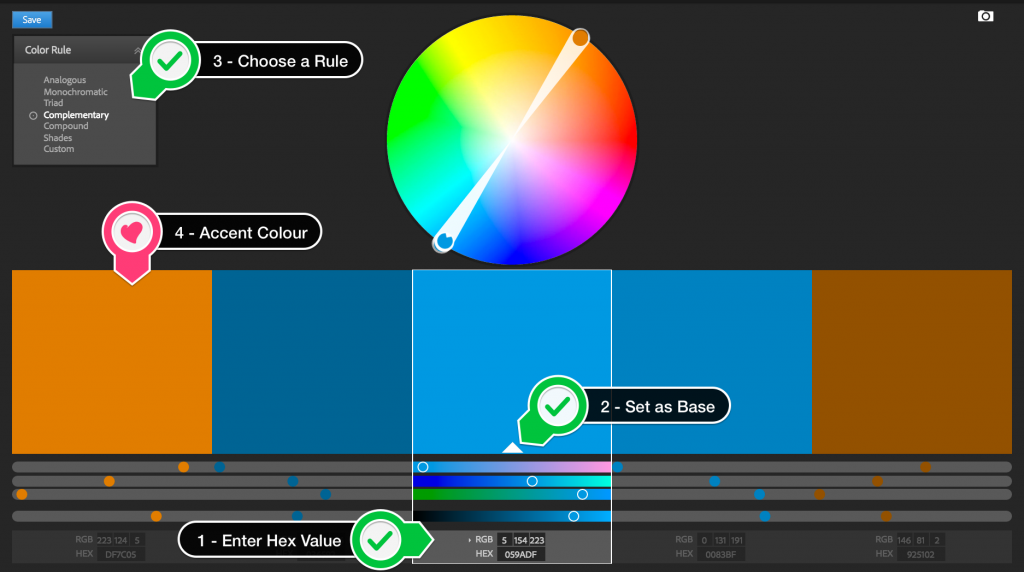
Choosing you Accent colour is really easy, once you have selected your Dominant colour (and have your Hex Value). Let me show you how to go about this using Adobe Color CC
Using Adobe Kuler/Adobe Color CC
Using Adobe Kuler/Adobe Color CC
Head over to the Adobe Kuler website.
- Enter your Hex Value in the middle box (as shown below)
- Click on that small arrow and set that colour as base
- Select any of the options from “Color Rule” (in the below example, I have used Complementary)
- And Baam! You have a few colours you can choose from.

Let me also quickly run through the different “Color Rules” (as stated on Adobe Blog)
- Analogous: Using colours that are adjacent on the colour wheel. They usually blend well with one another and are harmonious and pleasing to the eye.
- Monochromatic: Using variations in saturation and brightness of a single colour. They go well together and produce a soothing effect. (If you use this rule, go for the brightest colour as the Accent Colour)
- Triad: Using colours that are evenly spaced around at 3 equidistant points on the colour wheel. They tend to be contrasting while retaining harmony when used together.
- Complementary: Using colours that are opposite to each other on the colour wheel. They give a very high contrast and tend to stand out when used together.
- Compound: Using a mix of Analogous and Complementary colours. They provide a strong visual contrast as the complementary colours, but has less pressure.
- Shades: Using variations in brightness of a single colour (You may use this when you come to Step 3)
I would recommend selecting two Accent colours – one that would look great with white text on it (i.e. a darker shade) and another that would go well with black text (i.e. a lighter shade).
Now my palette has grown to 5 colours. In the order, they are Accent (light),Dominant (tint), Dominant,Dominant (shade) and Accent (dark).
Step 3: Putting it all together!
Your colour palette is ready – yes, already! All you need is those 5 colours and Black and White.
If you are thinking – what about my Background colour, Text colour etc, hold your thoughts. I am going to tell you a way to put this all together.
Background
In my opinion, the background colour choice is completely dependent on what is going to be on the website.
- Focusing on Branding? (for e.g. the homepage of your business) Use shades of the Dominant Colour as your background. If your Dominant colour is very bright and overwhelming, go for a lighter or darker version to soothe it down a little.
- Focusing on Content? (for e.g. the portfolio page of your business or a blog) Use a white or light background. In this case, you can use your Dominant and Accent colours to highlight the key areas.
- Focusing on Creativity? My advise… break the rules! Go for an inspiring background image rather than a single-tone colour.
Foreground
For the Foreground colour which goes on the header and footer there is a very simple rule – Contrast! If the background is dark, go for a light foreground and vice versa. If the background is a bright colour, go for a shade darker or lighter.
Text
When it comes to text colour, I would suggest following the expert advice from Google (Material Design). Choose between Black or White only! Yes that is right – no greys, no colours. Keep the colours for accentuating titles, links and other design elements. And if you already followed my bonus tip under Step 1 (under Get Hex Value), you already know how good Black/White text looks on your Dominant Colour.
Use Opacity instead of Grey
Use Opacity instead of Grey
As advised in the Material Design guidelines:
Text can displayed with different degrees of opacity to convey how important certain information is relative to other information. The level of opacity used for text depends on whether your background is darker or lighter.
Black or white text that is transparent remains legible and vibrant against background colour changes. This makes it more flexible than grey text in the same contexts.
On light backgrounds, use black in the following range of opacity.
- Regular text content = 87% opacity
- Secondary text (example aside notes) = 54% opacity
- Text hints (e.g. text boxes) = 38% opacity
- Dividers = 12% opacity
On dark backgrounds, use white in the following range of opacity.
- Regular text content = 100% opacity
- Secondary text (example aside notes) = 70% opacity
- Text hints (e.g. text boxes) = 50% opacity
- Dividers = 12% opacity
Headers and Menu
Imagine you are skimming through your webpage. Look at the key areas you want your website visitor to glance at to give an overall outline of the page. These are the areas where you should use the Dominant colour. You can either use the Dominant colour as the text colour or use it as a background to the text. Use your Dominant colour in a limited number of places on the website only, like:
- Logo
- Menu Items
- Headlines
- Buttons
Subheadings and Links
Use the Accent colour for the second set of important areas on your webpage. These include:
- Current Selected Menu Item
- Subheadings
- Quotes or Information Boxes
- Links
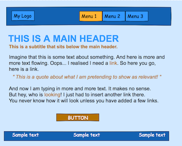
In the example I chose, because the Dominant colour is bright, I used Dominant (tint) as the background. I decided to then use the Dominant (shade) for the foreground. You can see how a sample website will look with the colour palette I created.

Since in the example I am showing you there is a lot of text, there is one thing that can be done to improve the look – insert a white boxed area onto which you can overlay the text.
Hope you found this article useful. Let me know your thoughts in the comments below.
There is another method to create a colour palette. Especially if you have an inspiration in mind. I will be back with that. So stay tuned!
 Sony Simon Live. Love. Learn.
