 Sony Simon Live. Love. Learn.
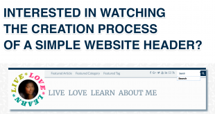
In my previous article, I shared two types of page layouts. In this day and age of smartphones, phabletsSmartphones having a screen which is intermediate in size between that of a typical smartphone and a tablet computer. and tablets, there is another design approach that is very effective. This is popularly known as the Responsive Web Design (RWD).
In one of my previous articles on creating Fluid Grid System for your website, I mentioned about this approach. RWDResponsive Web Design allows users to view the web pages across a broad range of devices and browsers in an easy to read layout and navigate with a minimum of resizing, panning, and scrolling. The three key aspects of a website designed using RWD approach are:
- Fluid grids
- Flexible images and
- CSS3 media queries
#1 Fluid Grids
In a fluid grid system, a web page is divided into columns. Using this grid view makes it easier for web designers and developers to place elements on the page.
You can read all about creating a Fluid Grid System for your website in my previous article.
#2 Fluid Images

I consider the book Flexible Web Design: Creating Liquid and Elastic Layouts with CSS by Zoe Mickley Gillenwater the bible in this topic. If you are new to Web Development then this is one of the must-read books in this category. In this book, there are three approaches proposed to create fluid images.
1. Scale the Images
Just like setting flexible page size, you can also scale the image based on the device screen or browser dimensions. For example, in the below two videos you can see how the same photo of my robot Leo is displayed without and with scaling.
2. Reveal Specific Portions of the Images
Sometimes scaling can decrease the clarity of the important features of the image. Here is an example of an image where the key feature (aka my face) is on the right side of the image. By doing “variable cropping” and floating the image to the right this can be converted to a fluid image. It is also advisable to set some width delimiters (min-width or max-width) to avoid cropping or excessive white spaces (which I have not done in the example).
3. Create Sliding Composite Images
This is a creative way of displaying images by splitting images into separate layers. You can implement this in so many ways depending on what you want to achieve.
In this example, I want to display the image of the beach in full irrespective of the screen size. I also want the circular image of my face to be displayed without any distortion. So in this case, I have separated them into two images placing them in layers. Watch the effect in the video below.
Here is another example shared by Zoe the author of the book.
#3 CSS3 Media Queries
A Media query is a CSS technique that uses the @media rule to include a block of CSS properties only if a certain condition is true. Media queries look at the capability of the device by gathering information such as:
- width and height of the viewportbrowser display area
- width and height of the device screen
- orientation (i.e. landscape or portrait)
- screen resolution
In my article on creating a Fluid Grid System for your website, in Step 3 I used media queries to set breakpoints to adjust the grid widths (see example below).
/* MOBILE SIZE */
@media (max-width: 480px) {
  [class*='col-'] {
    width: 100%;
   }
}
Using media queries, the website can implement different stylesheets based on the device capability.
<link rel="stylesheet" media="only screen and (max-width: 500px)" href="mystylesheet.css">
You can use this handy tool by Michael Gannon available at http://simplecss.eu to generate CSS Media queries for all mobile devices with a heavy emphasis on a graphical based user experience.